Collectibles
One of my first tasks was to expand the range of collectible badges for users. Below are concepts showing how badges could be upgraded based on specific achievements.

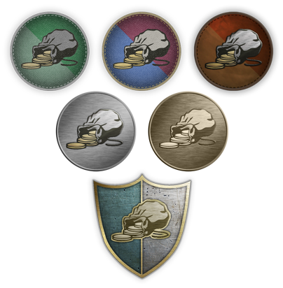
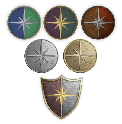
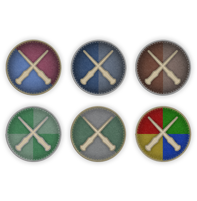
The badges were designed with a skeuomorphic style, avoiding the four Hogwarts house colours while remaining authentic, detailed, and reflective of the tasks required to earn them, like brewing potions or casting spells.
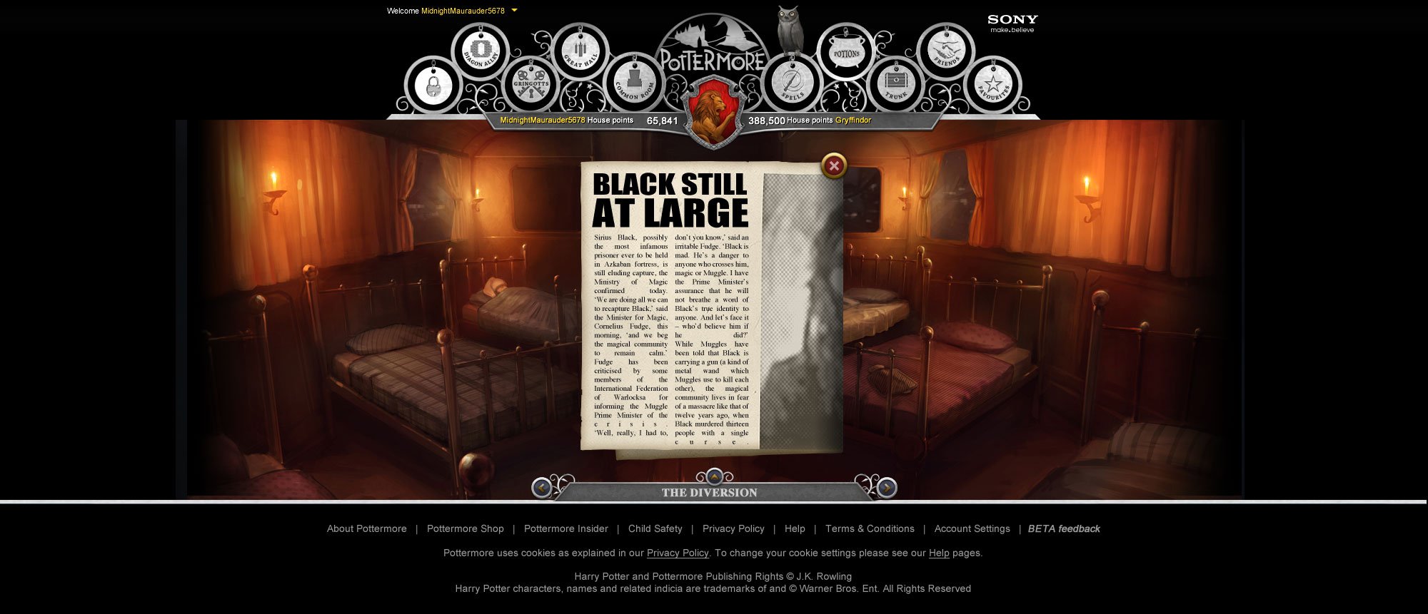
Articles
I designed all article overlays, visualising in-world texts styled as fictional newspapers.
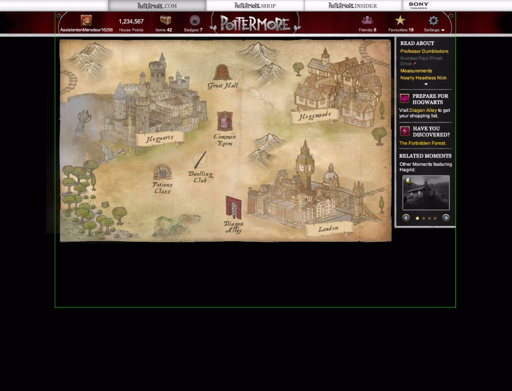
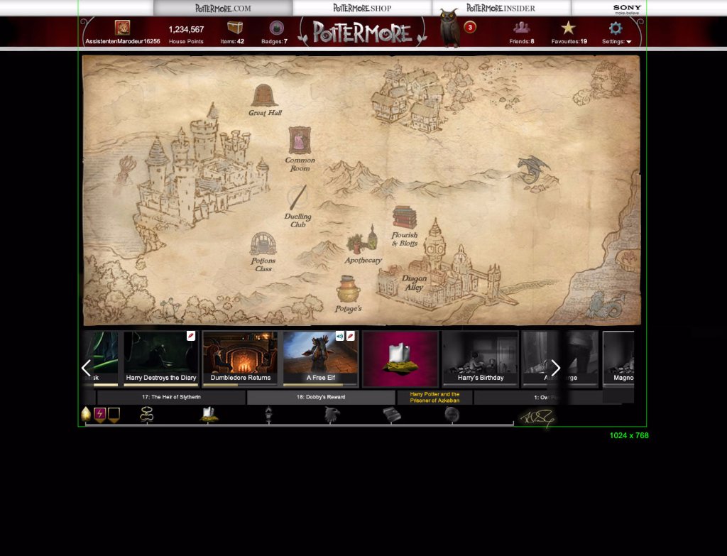
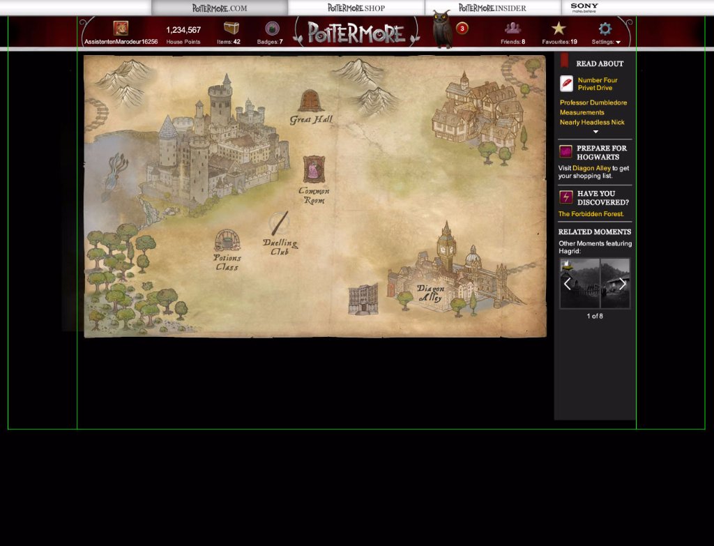
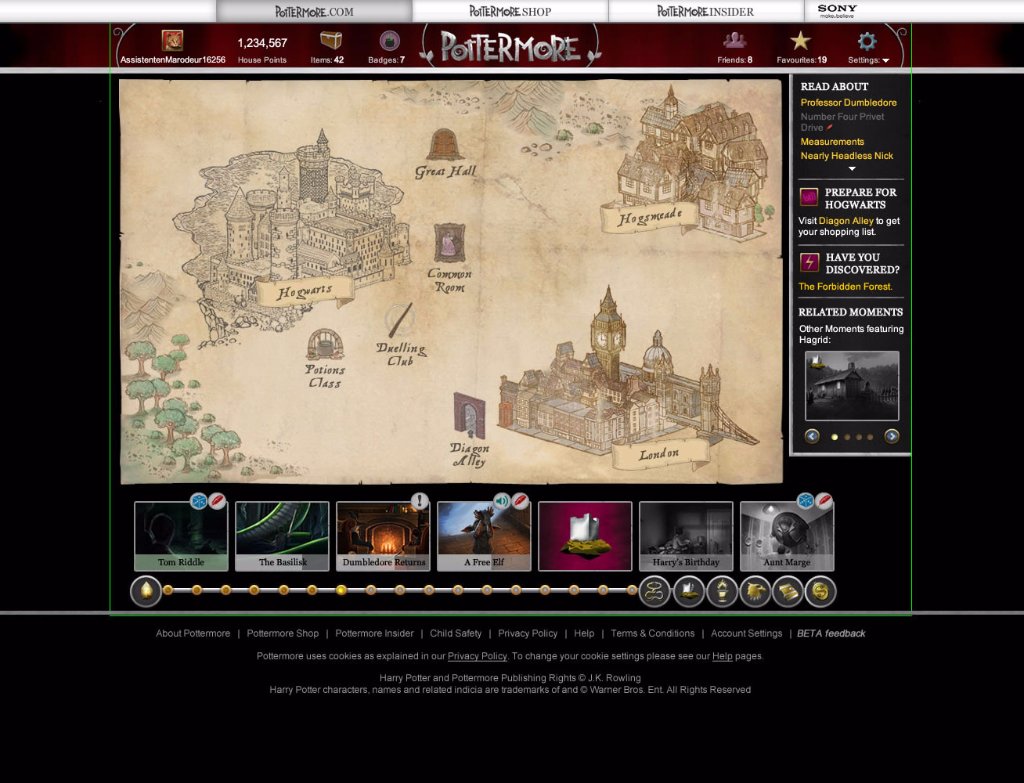
The Pottermore Map
One of the most challenging tasks was designing the Pottermore Map, a central hub for navigating locations across the platform.
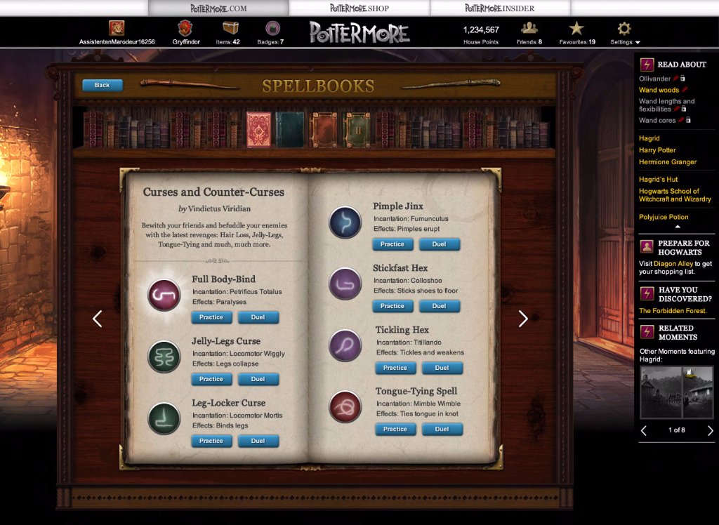
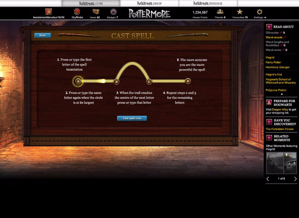
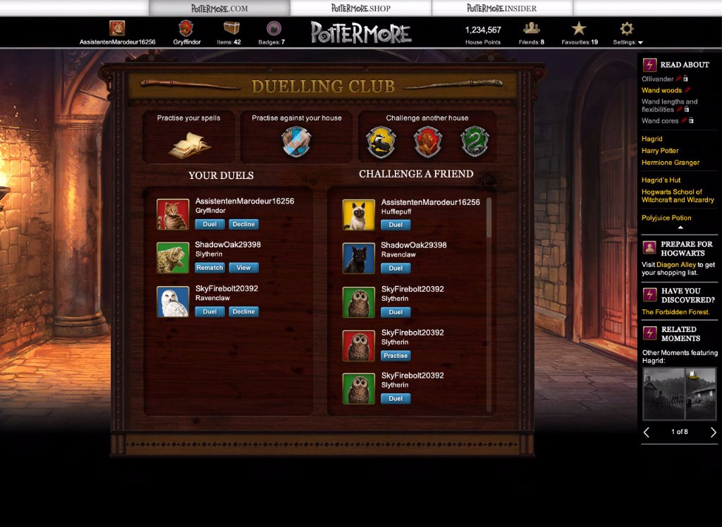
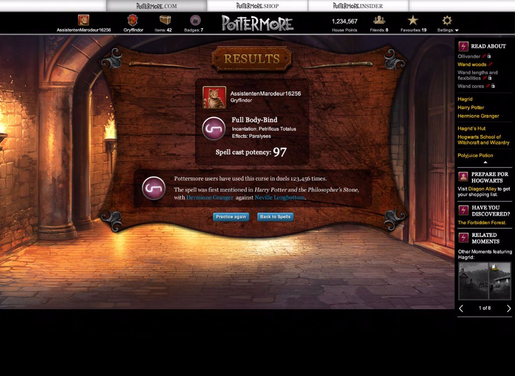
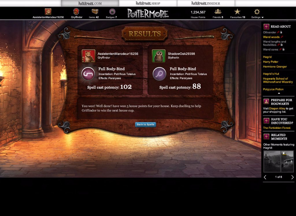
Duelling Club
These unused designs for Pottermore’s Duelling Club showcase an interactive feature that needed a simpler, more intuitive user journey.
Book End Matter
When Bloomsbury released new Harry Potter editions in 2014, Pottermore was asked to provide end matter for each book. The goal was to highlight relevant online content and draw readers back to pottermore.com.
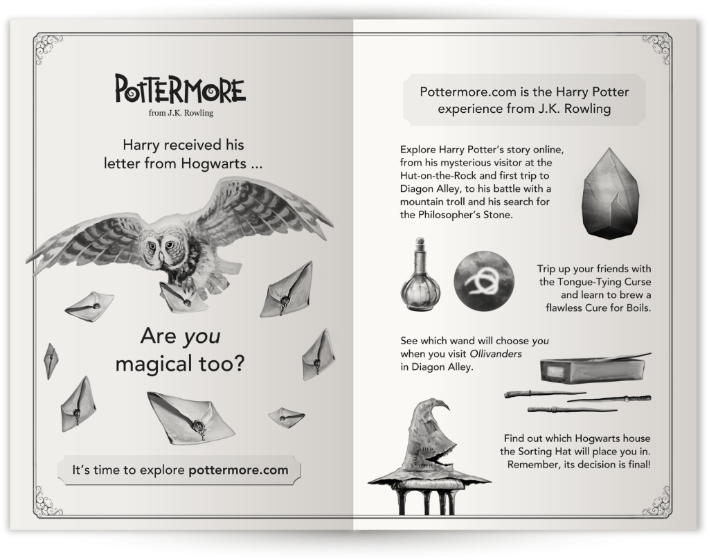
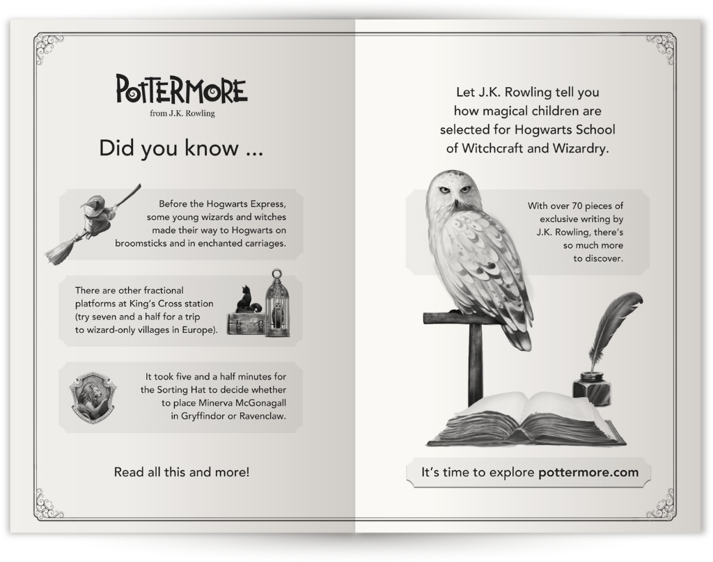
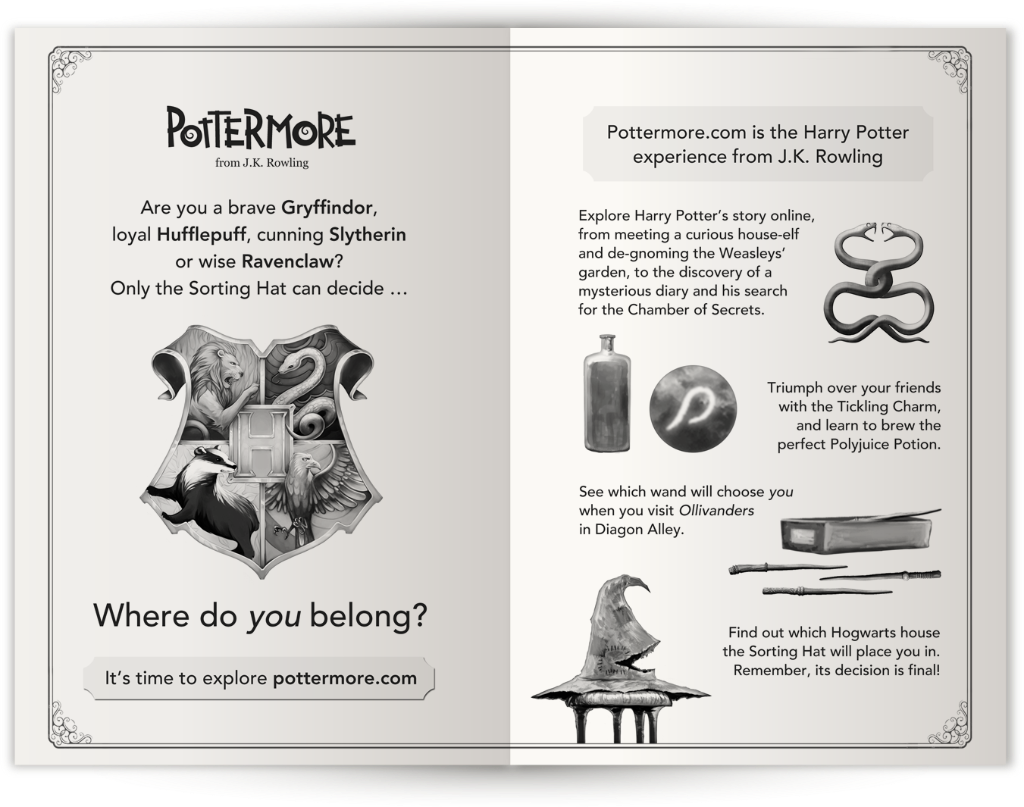
The content needed to introduce Pottermore to new users and, most importantly, preview exclusive writing from J.K. Rowling. Messaging had to be clear and accessible, while also re-engaging lapsed users.
Working closely with Bloomsbury and our marketing team, I developed concept designs aimed at capturing the attention of readers just finishing each book.
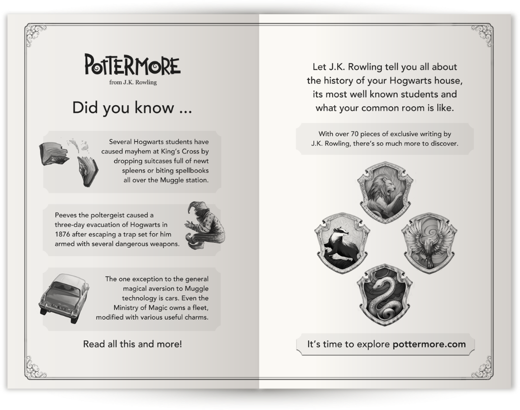
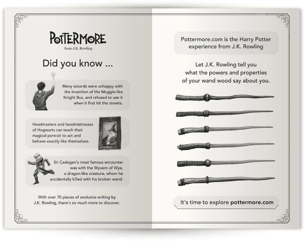
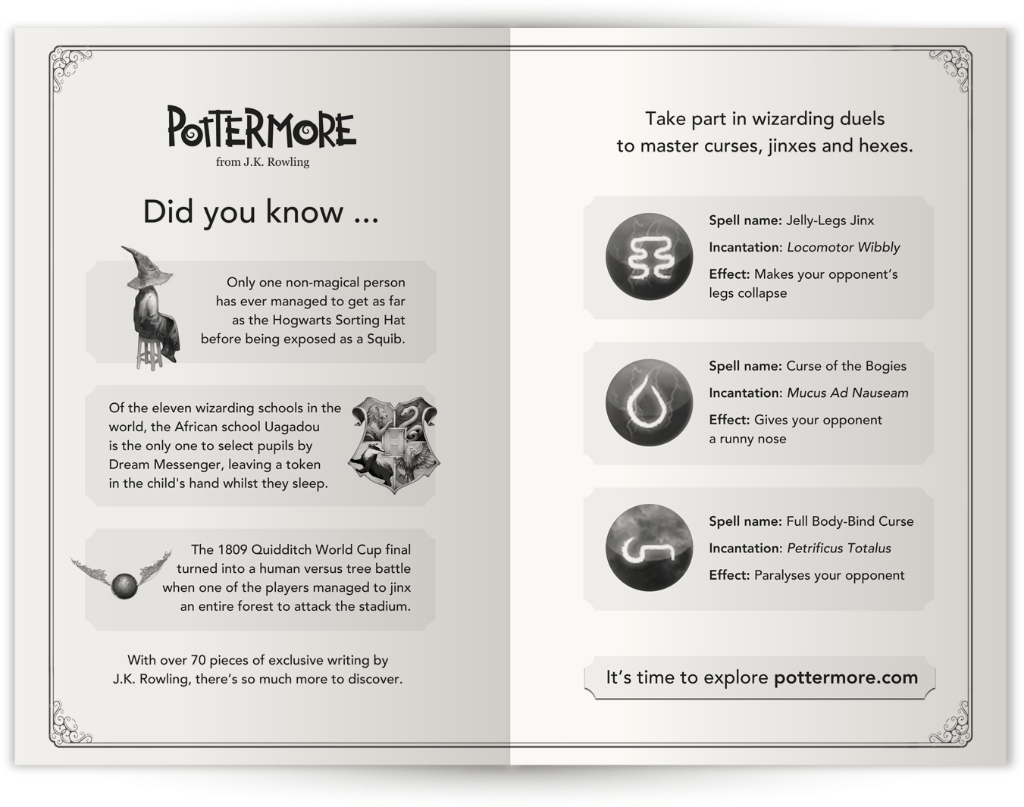
To ensure consistency, imagery from pottermore.com was used across all end matter, creating a recognisable format from book to book.
The first two books featured two double-page spreads to explain Pottermore and its features in detail, while the remaining five had single spreads.
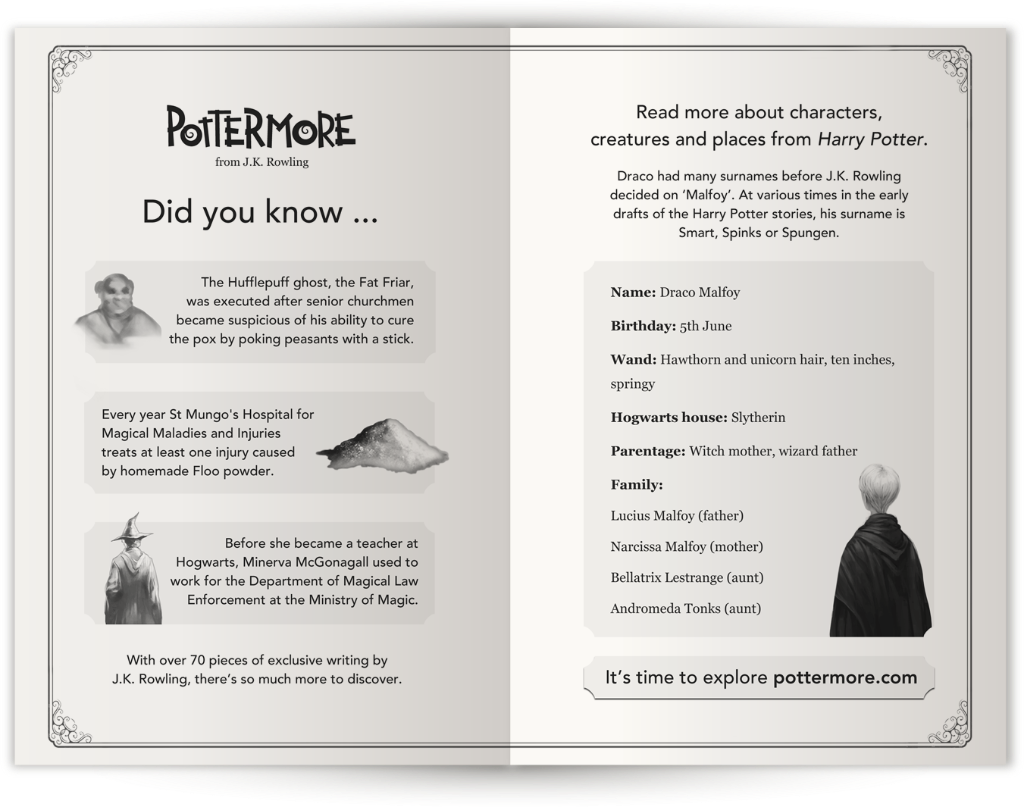
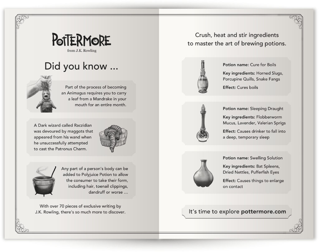
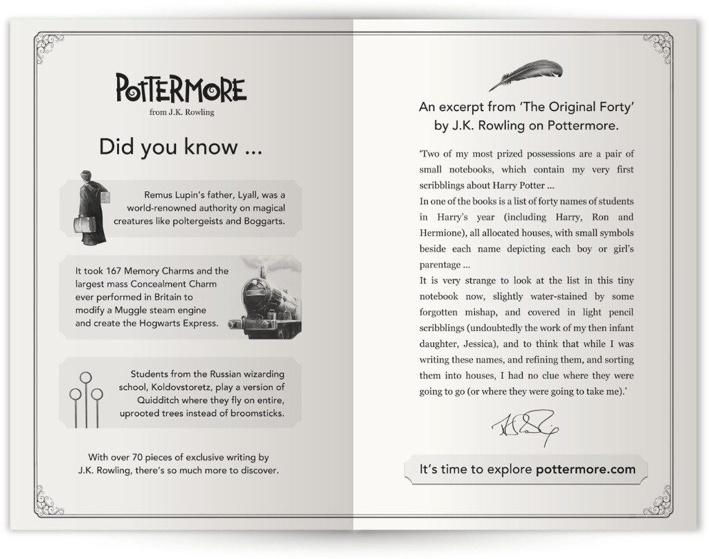
Once the format was agreed, I adapted the designs for print, ensuring imagery reproduced well on absorbent paper and in greyscale without appearing too dark. Finding artwork that held up in these conditions was a key challenge.
I'm proud of the work and hope the end matter helped bring new users to pottermore.com.
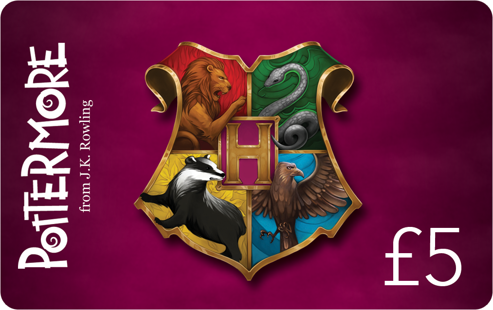
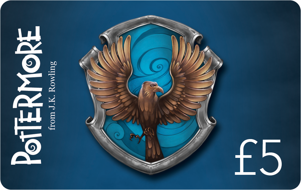
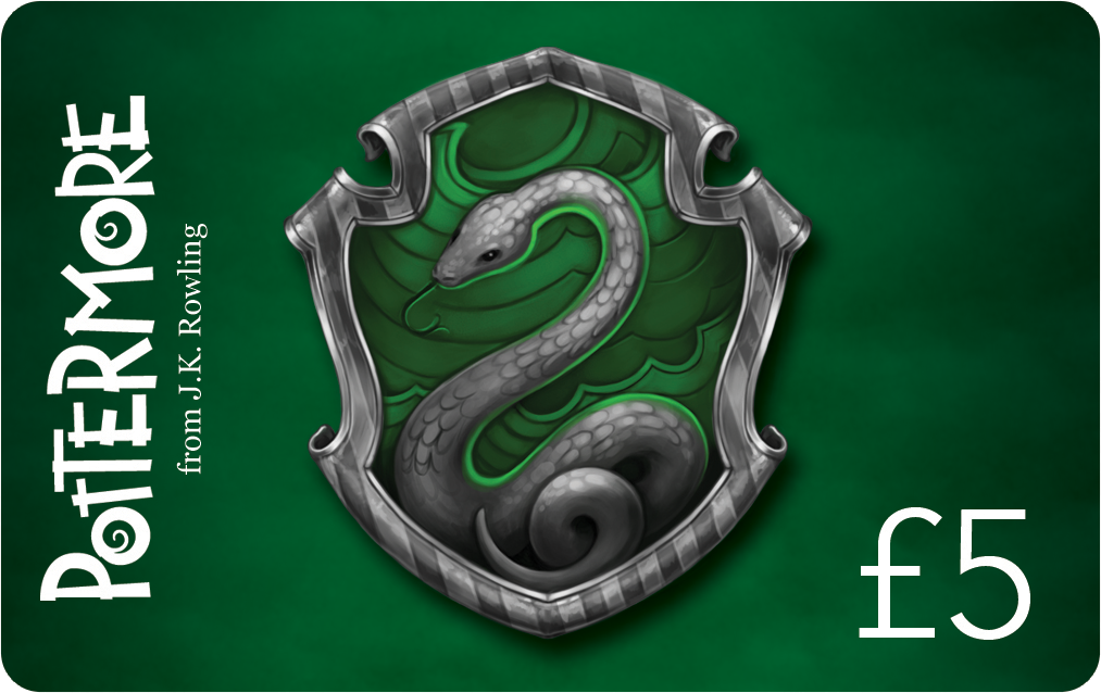
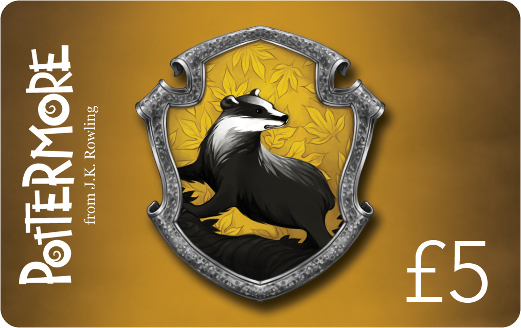
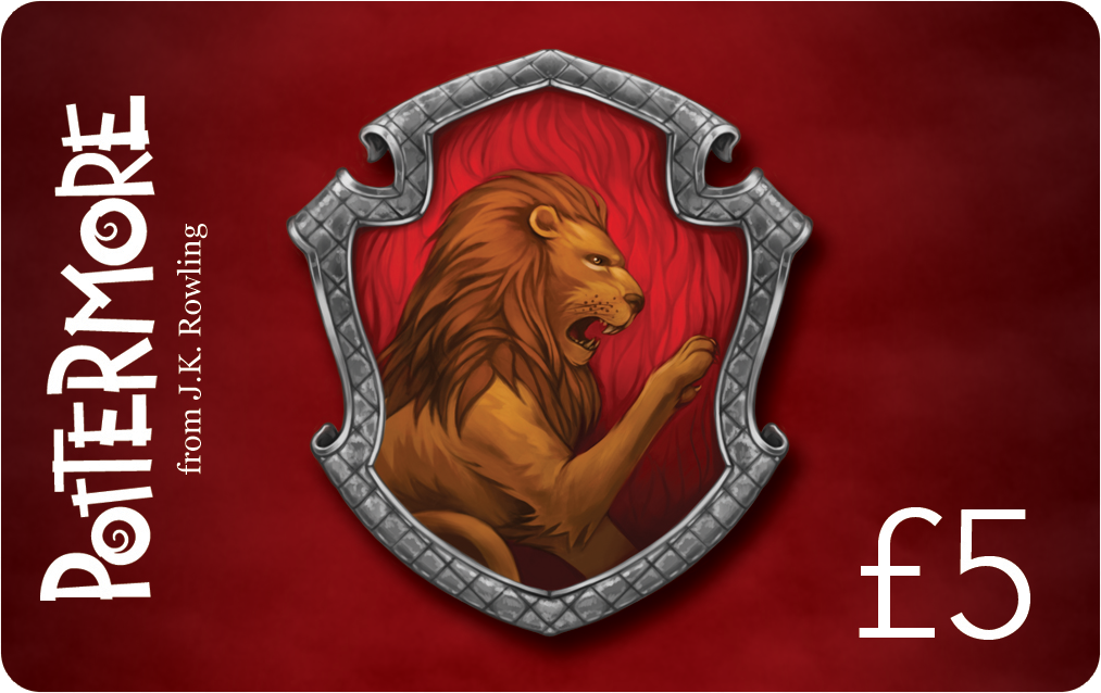
Gift Cards
I designed a set of gift cards for redeeming Harry Potter eBooks, one themed around the Hogwarts houses, and another more generic set for multiple-book redemptions.


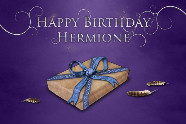
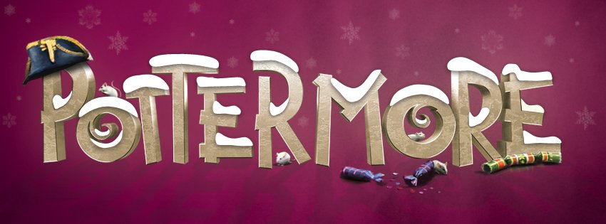
Social Assets
I also created campaign assets for the brand’s social platforms.